Funds and Reimbursement Center
Responsibilities
Research • Sketches • Wireframes • High fidelity mockups • Spec documents
Challenge
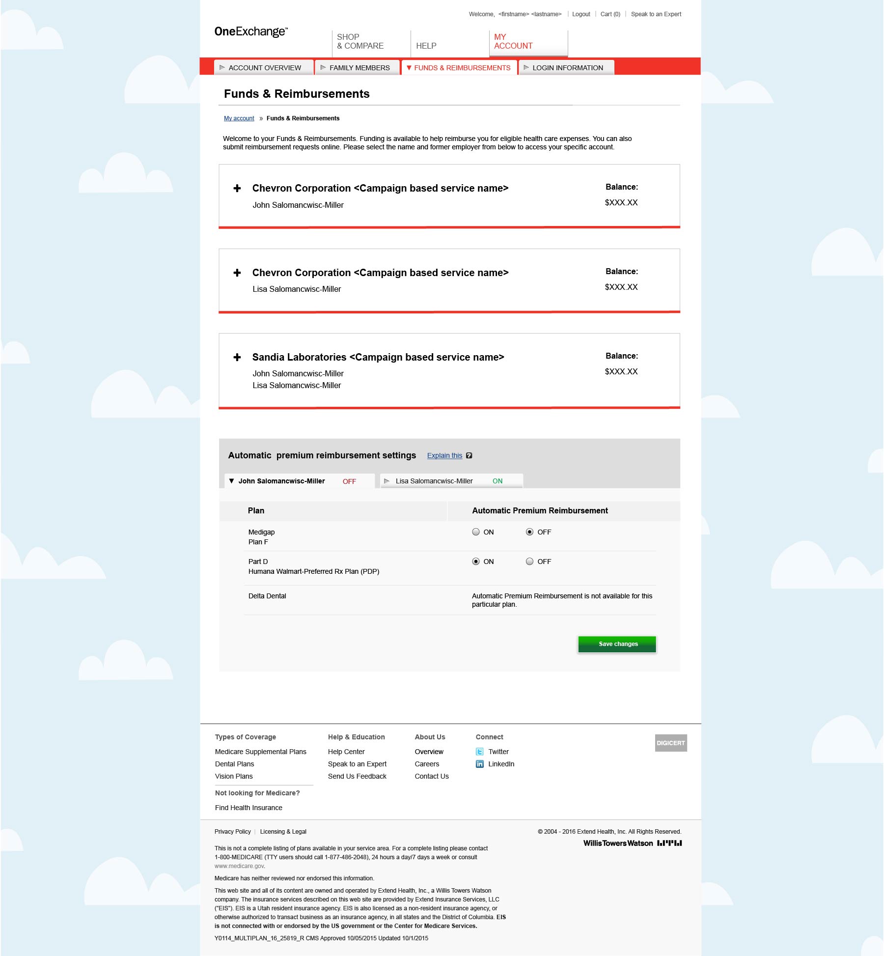
Our retired users often receive funds from their previous employers. These funds are managed by a third party website, which they access through our site. Users could see basic information on our site, but had to go to the third party site for more information or to submit a claim. Our goal was to reduce the number of calls to the call center by making reimbursement forms and information easier to find.
Process
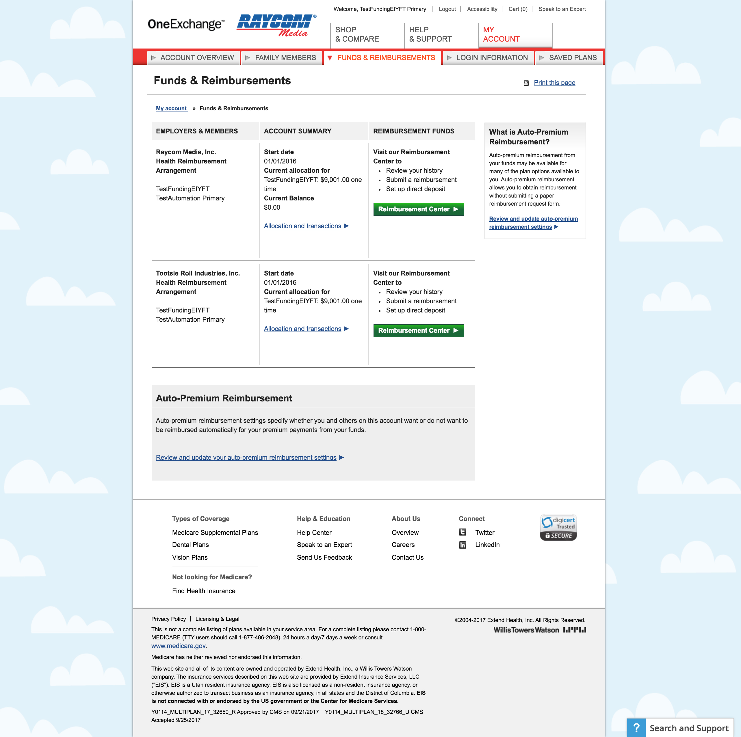
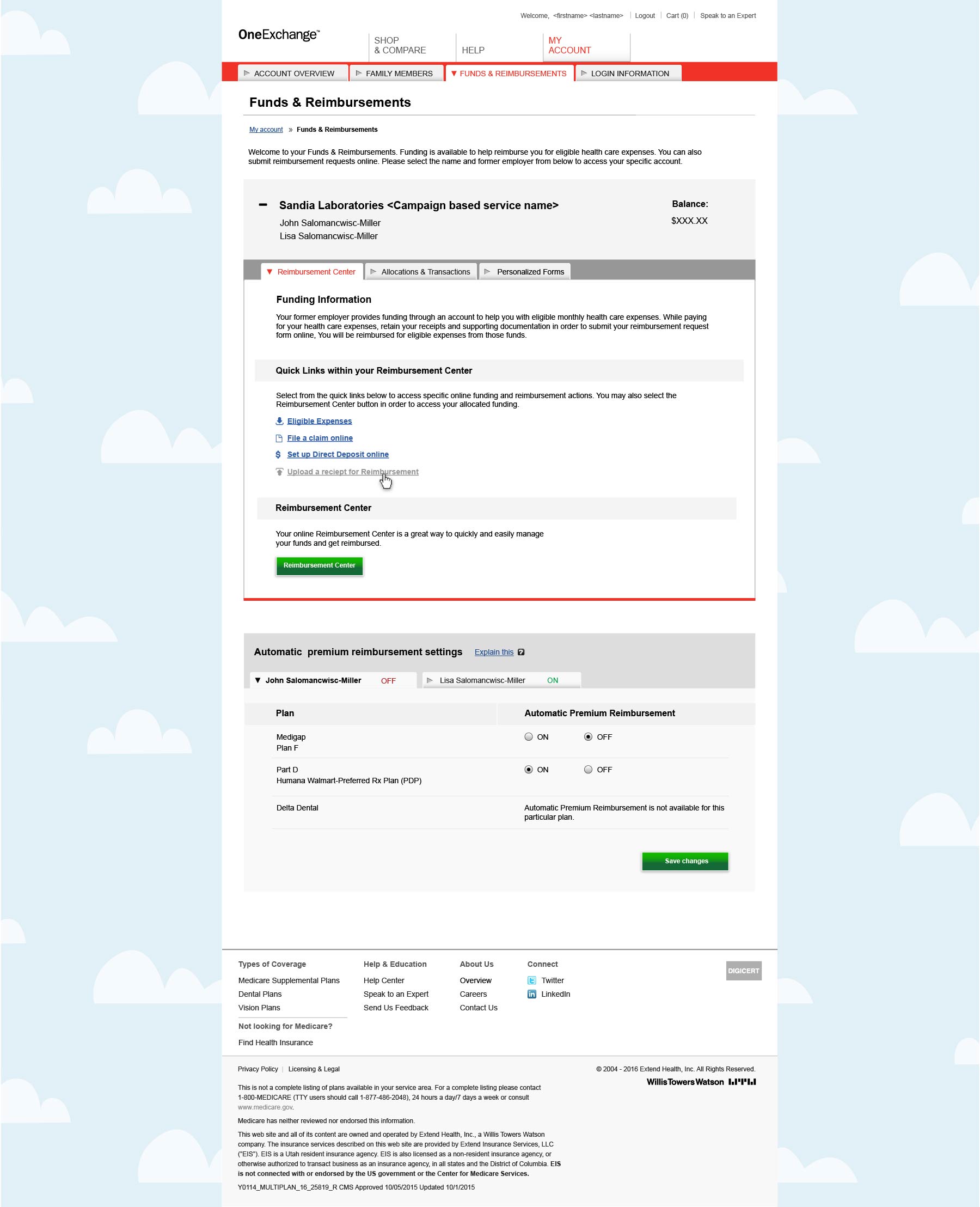
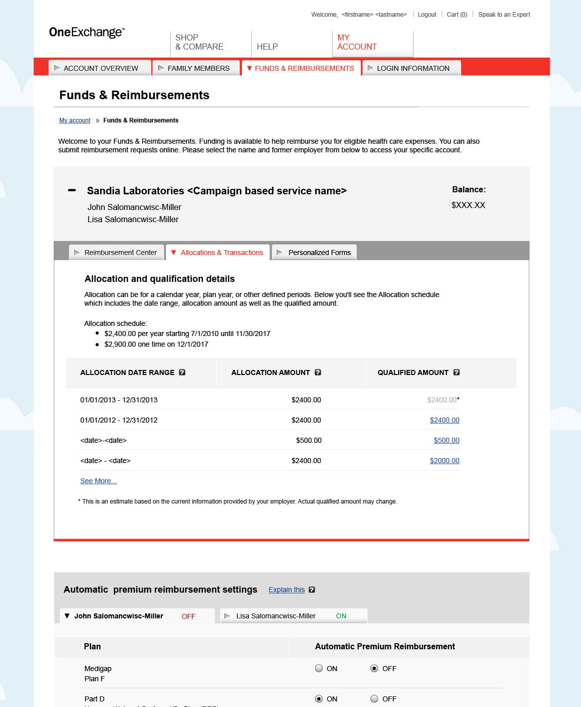
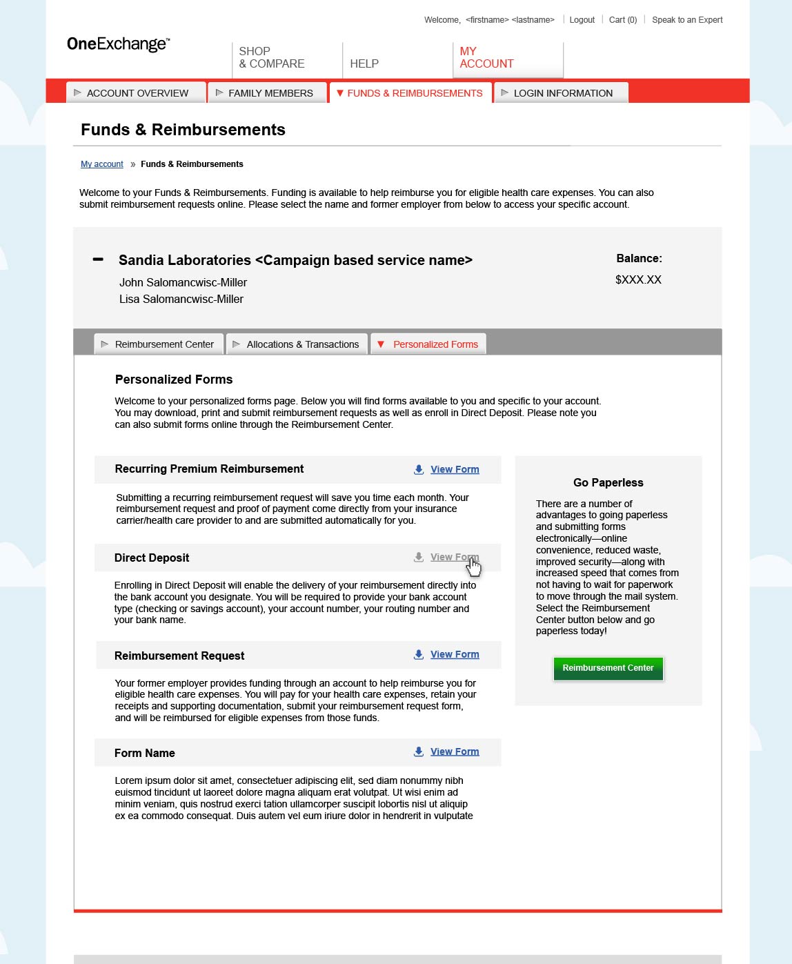
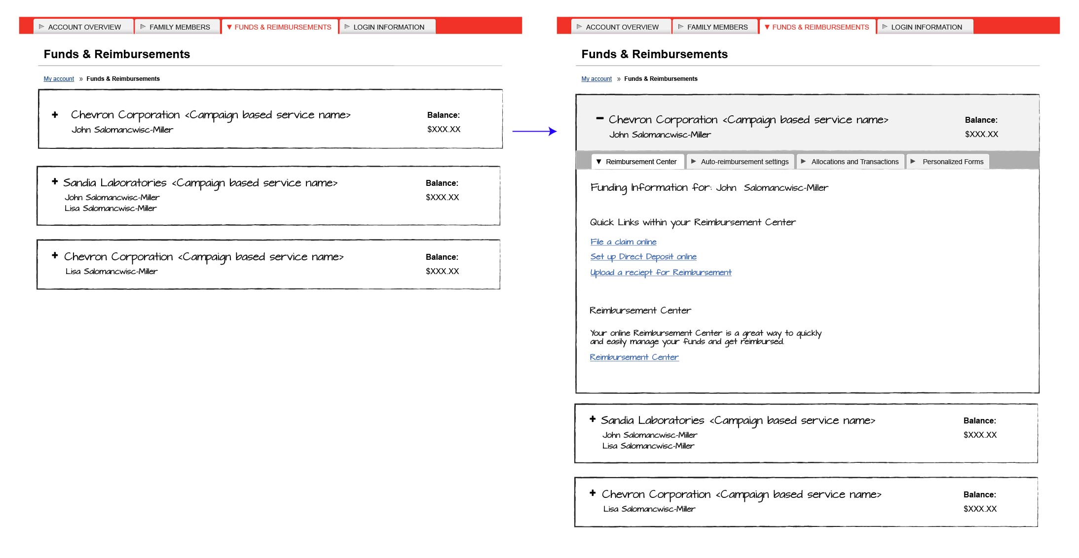
We needed to add the user's forms to our site as well as deep links that would take users to specific areas of the third party site. Rather than just tack on new features, I saw this as an opportunity to improve the funding page's information hierarchy and visual design. The current design was dated and our user feedback showed that there were usability issues.
The users needed an organized place where they could quickly and easily access their information. I started by creating a consistent information hierarchy and then started sketches of flexible user interfaces that would work for multiple account variations.
Although I didn't have access to our Medicare users, I got feedback from as many people that I could, especially people who were intimately familiar with the Medicare site and its users.
After several sketches and wireframe iterations, I decided to use a drawer interaction for the funding accounts. This would give the page a clear information hierarchy and keep the page organized for users with multiple funding accounts (more than one company giving them money). It also allowed participants to compare multiple accounts without having to switch back and forth between pages.
Outcome